Case Study:Lipton Packaging

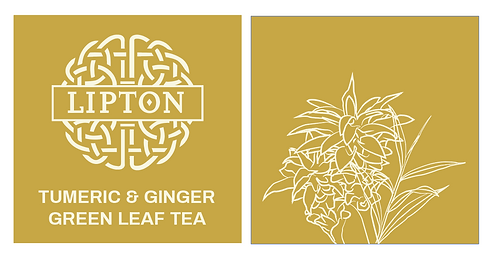
This design intends to marry the heritage of Lipton’s founder with the aristocratic origins of tea, while still making the product recognizable as organically grown. The Celtic knotwork and swooping lines of the illustrations call to mind the illuminated manuscripts and accessories found through the early British Isles. The direct depiction of the ingredients, meanwhile, helps improve product recognition and evoke familiarity. While nowadays exotic plants from all corners of the globe can be obtained readily, Lipton was and is a pioneer in providing quality samples. Through the use of a limited palette that is mostly black - a color regarded as sophisticated in modernity- and the use of metallic foils, the packaging is rendered to evoke a feeling of luxury in the way perfume and fine jewelry do. Keeping the design clean and elegant was top priority during its conception.


More Like This:


